

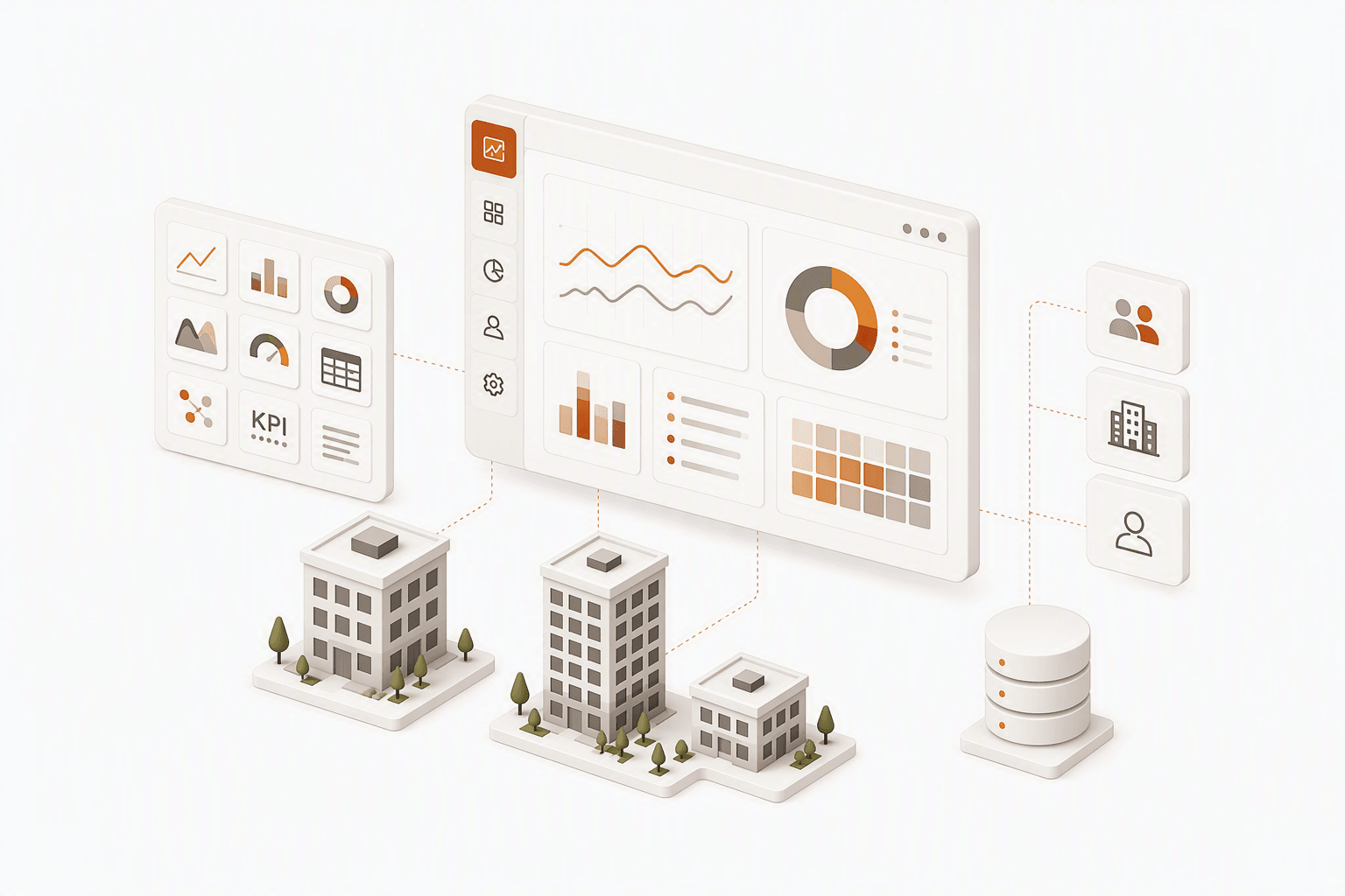
Cloud SupervisorDashboard Builder
Making complex building data easier to configure, visualize and act on.
- My contribution
- Led end-to-end experience design for Dashboard Builder, turning complex data configuration into a structured, self-service workflow.
- Role
- Lead Product Designer
- Team
- Product · Engineering · Design
- Focus areas
- UX Strategy · Interaction Design · Usability
Useful views were hard to build.
Niagara Cloud Suite connected buildings and captured operational data at scale. But creating meaningful dashboards remained technical, repetitive, and difficult to scale.
Key challenges
Empathy and User Journey Map
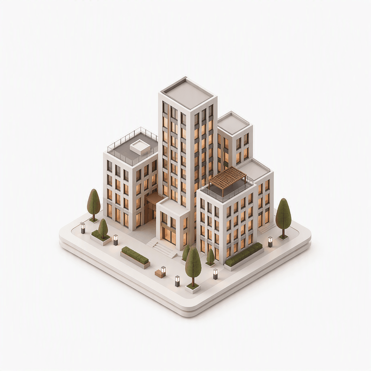
Sites managed by system integrators
Empathy and User Journey Map
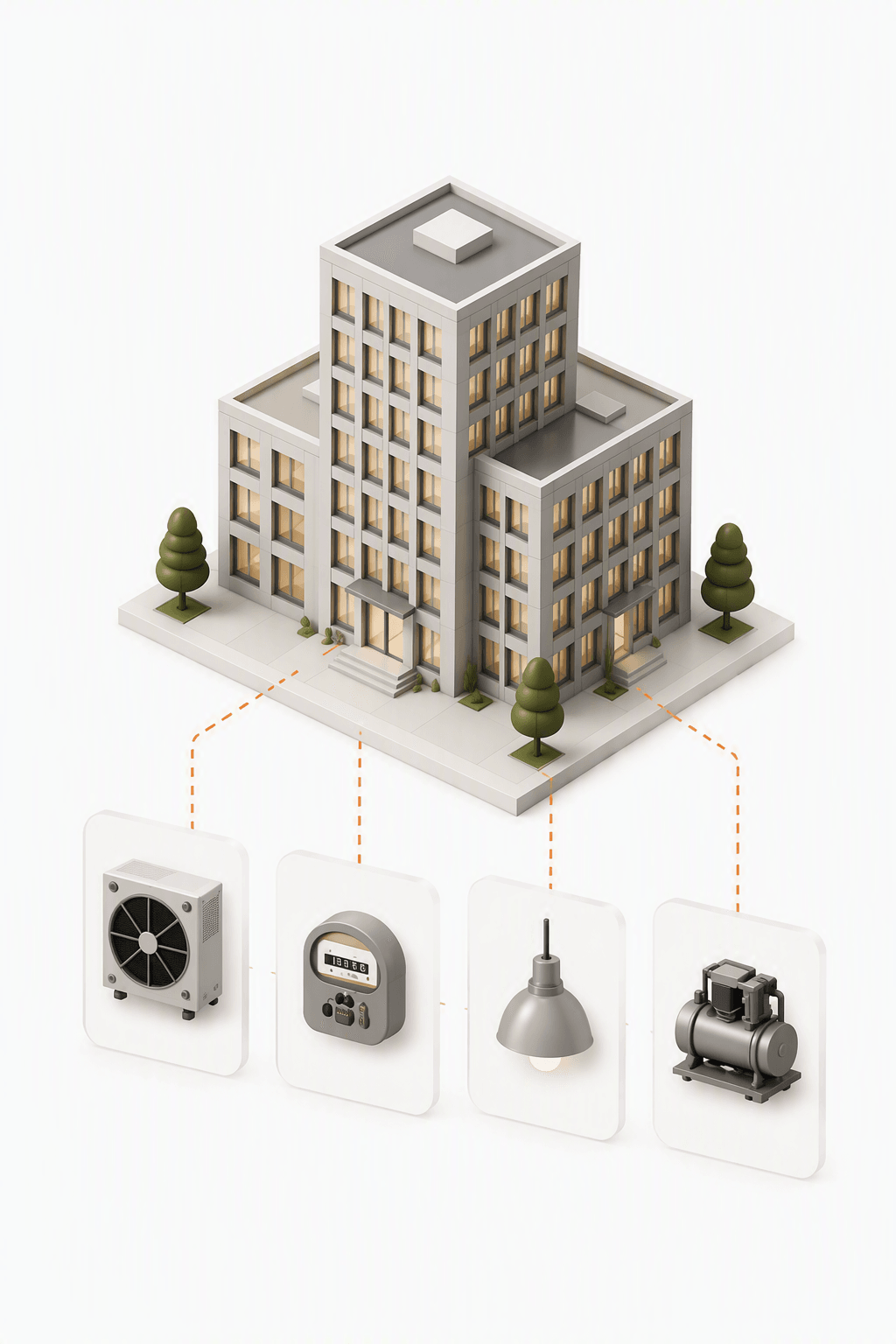
Of devices & data points per site
Empathy and User Journey Map
Stakeholders with unique needs
How could users build role-relevant dashboards without deep knowledge of the underlying data structure?
Different roles.
One shared need for less complexity.
We spoke with system integrators and facility teams to understand how dashboards are created, shared and used in daily operations.
Two distinct perspectives

System Integrators
Build · Configure · Reuse
- Create dashboards across customers and sites
- Connect relevant operational data
- Reuse and share reliable views
Primary need
Configure once. Reuse with confidence.

Facility & Operations Teams
Monitor · Interpret · Respond
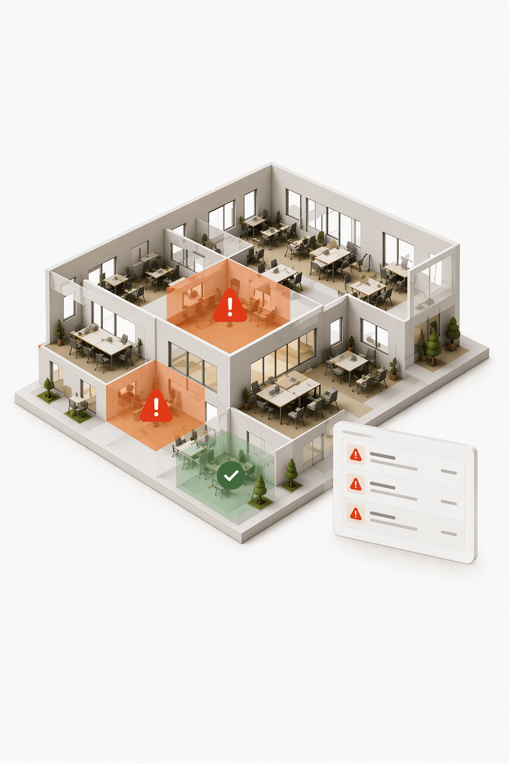
- Monitor relevant operational conditions
- Find issues without navigating technical structures
- Act on clear, current information
Primary need
See what matters. Act with confidence.
Key insights
Start with intent
Users think in outcomes, not data points.
Design response: Begin with the intended view.
Make effort reusable
Similar dashboards were repeatedly rebuilt.
Design response: Provide templates and repeatable patterns.
Guide the choices
Unlimited flexibility introduced technical complexity.
Design response: Reveal only relevant, compatible options.
From a fixed dashboard
to a reusable builder.
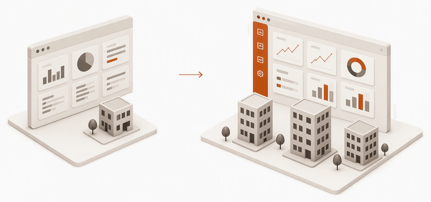
A cross-functional workshop and competitive analysis reframed our opportunity: shift from shipping static, pre-packaged views to building a highly configurable ecosystem for system integrators.
The shift
Pivot from delivering rigid, one-off dashboards to creating a scalable visualization framework that empowers teams.
From a dashboard
One predefined output
Consume a predefined view
Fixed layout and data connections
Rebuilt for each context
To a dashboard builder
A reusable creation capability
Compose configurable views
Customizable layout and data connections
Reuse across customers, sites and needs
Design principles
Guide without overwhelming
Use templates, progressive choices and compatible data to reduce complexity.
Support adaptation
Enable dashboards to be tailored across customers, sites and operational contexts.
Design for reuse
Turn layouts, widgets and configurations into repeatable starting points.
Start with intent.
Reveal only what's compatible.
Conversations with domain experts revealed a simpler starting point: begin with the intended outcome, not the underlying data structure.
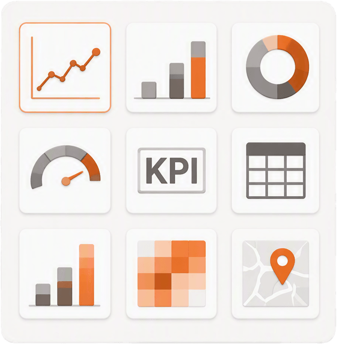
Select a visualization
Choose the chart or widget that best represents the intended insight.
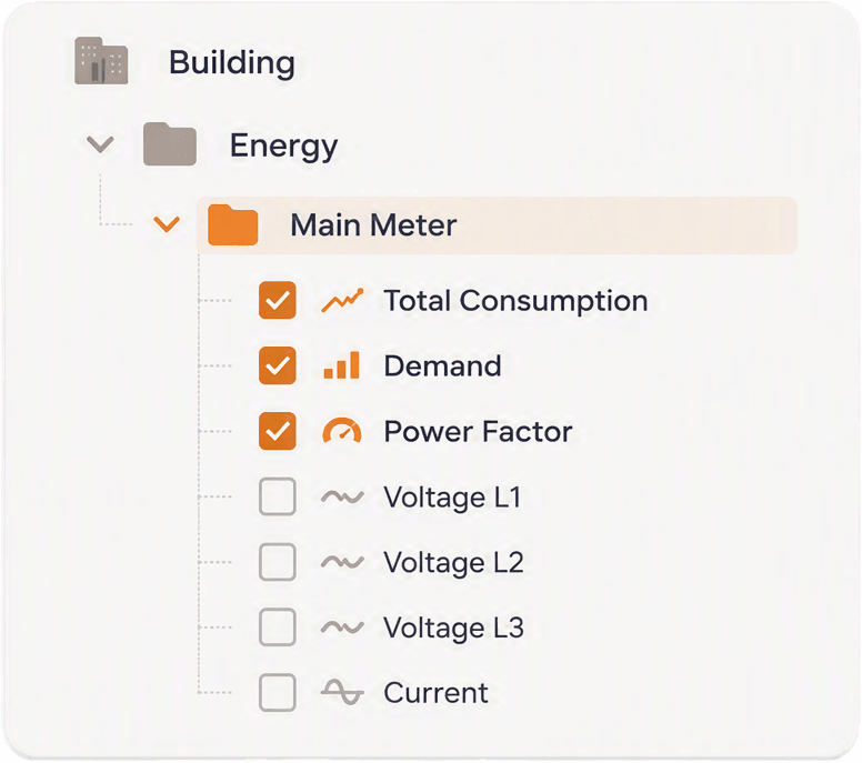
Connect compatible data
See only the points and properties supported by the selected visualization.
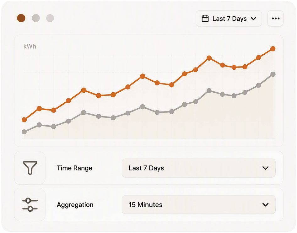
Preview in context
Review the populated visual and refine its data and settings.
Why this approach
Reduces cognitive load
Relevant choices replace the entire data structure.
Prevents incompatible mappings
Unsupported data and visual combinations are filtered out.
Supports exploration
Users can try another visual without restarting configuration.
Three capabilities.
One configurable experience.
Dashboard Builder combines guided starting points, reusable visualizations and compatible data selection to help users create meaningful operational dashboards.
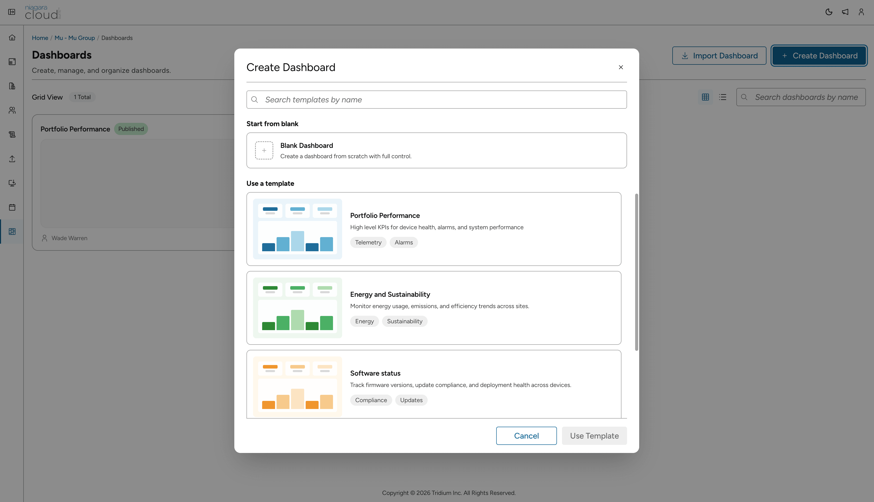
1. Guided starting points
Begin with structure, not a blank canvas.
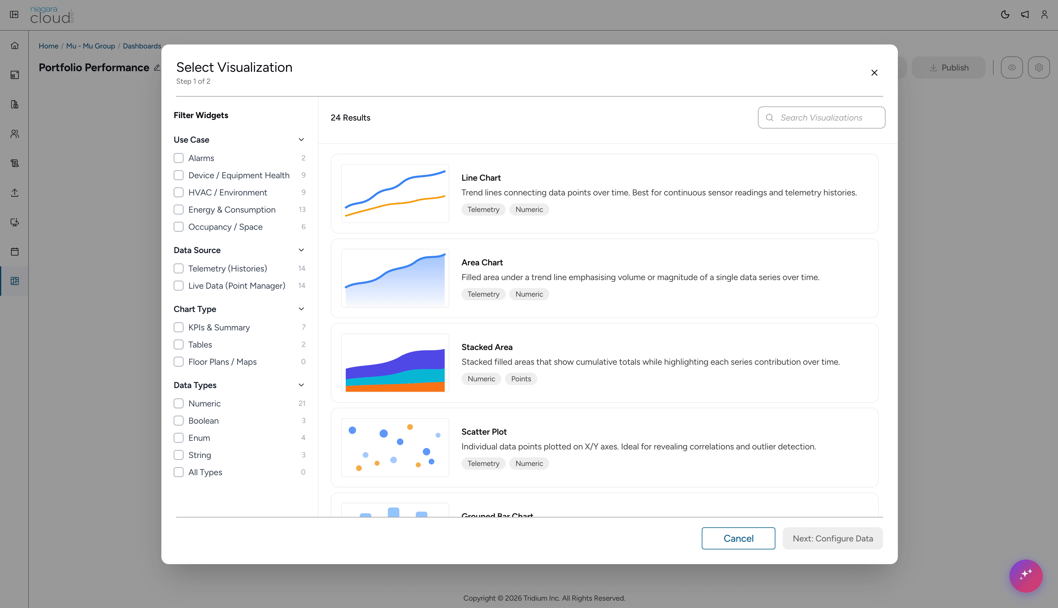
2. Visualization library
Find the right visual for the intended view.
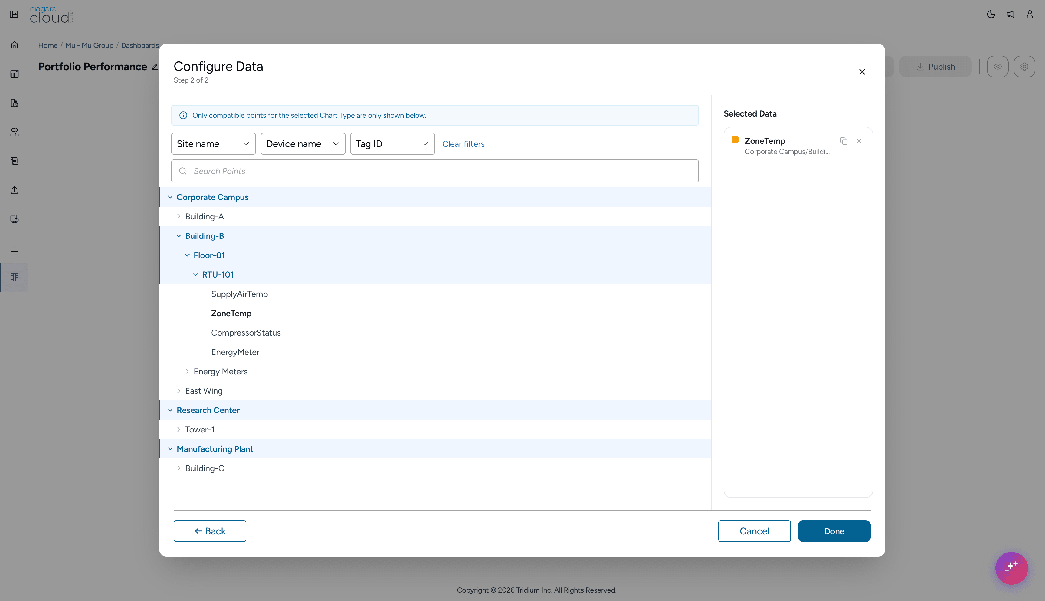
3. Compatible data selection
Connect only data that support visualization.
Reusable structure
Started from a template or established layout pattern.
Purpose-built widgets
Composed using consistent components for operational insights.
Relevant data connections
Configured through compatible points and properties.
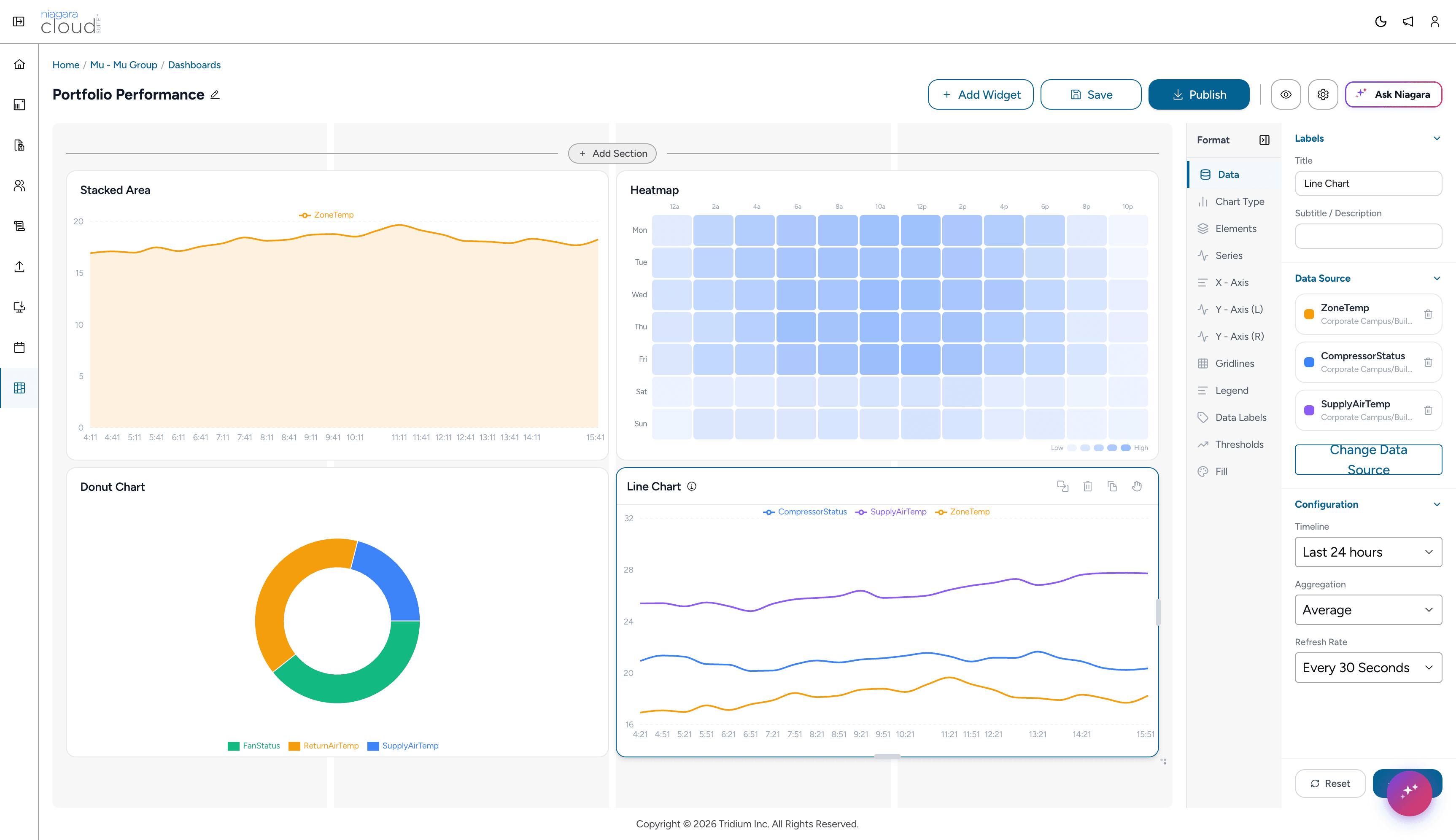
OutcomeA unified configuration workspace that transforms complex backend infrastructure data into highly accessible, role-relevant monitoring views at enterprise scale.
From dashboards to dialogue.
Ask Niagara.
Once dashboards established operational context, we explored how conversational assistance could help users investigate anomalies and patterns without leaving the view.
The dashboard remains the primary interface. Conversation extends it when deeper investigation is needed.
Energy consumption increased primarily due to higher HVAC load, driven by rising outside temperatures and longer operating hours.
Potential use cases

Explain anomalies
Ask why something changed and get a clear explanation.
Investigate causes
Drill down into factors influencing performance and behavior.
Explore trends
Ask questions across time to uncover patterns and outliers.
Validated with users.
Shaped by what we learned.
Moderated usability sessions with system integrators and facility teams helped validate the experience and refine the final direction.
What testing indicated
94%
Task completion
Successfully created and configured a dashboard using guided steps.
90%
Ease of connecting data
Found it easy to connect relevant data without needing to understand the underlying structure.
15–20 mins
Typical completion time
Created a meaningful dashboard using the guided workflow.
My reflection
The biggest challenge was not visualizing data. It was helping users connect the right data to the right visual without needing to understand the underlying structure.
Selected project details have been kept high-level to respect confidentiality and participant privacy. Additional process context can be discussed during an interview.

