

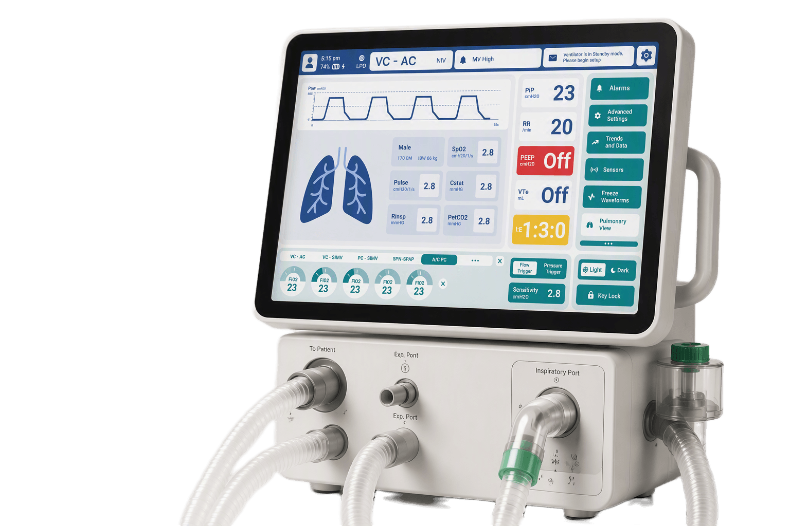
Critical Care VentilatorHMI
Making critical ventilation workflows easier to monitor, understand, and act on.
- My contribution
- Led the end-to-end HMI design, translating complex ventilation workflows into a clearer experience for patient monitoring, alarm response, and therapy adjustment.
- Role
- Lead Product Designer
- Team
- Clinical · Product · Engineering
- Focus areas
- Interaction Design · Visual Design · Usability
Aligning on what matters most
We explored ICU workflows, risks and information needs to uncover what matters most at the point of care.
Kickoff and alignment
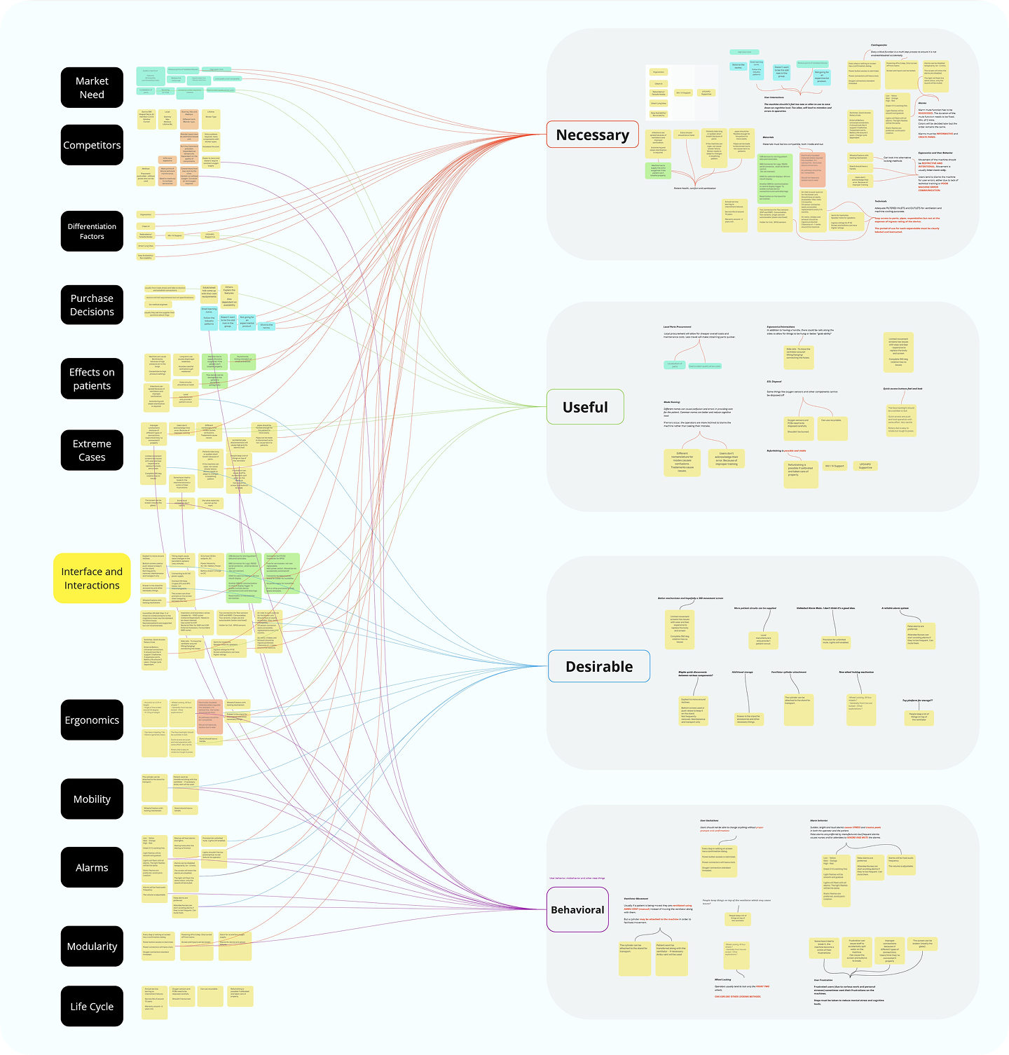
Field visits, clinician interviews and hands-on competitor reviews exposed the real constraints of critical care.
Inputs into priorities
Affinity clusters grouped observations across hardware, ergonomics and cognition to focus the redesign on what protects patients first.
Complex to operate.
Critical to get right.
In critical moments, speed and clarity save lives. Current interfaces create confusion and dangerous delays.
Key challenges
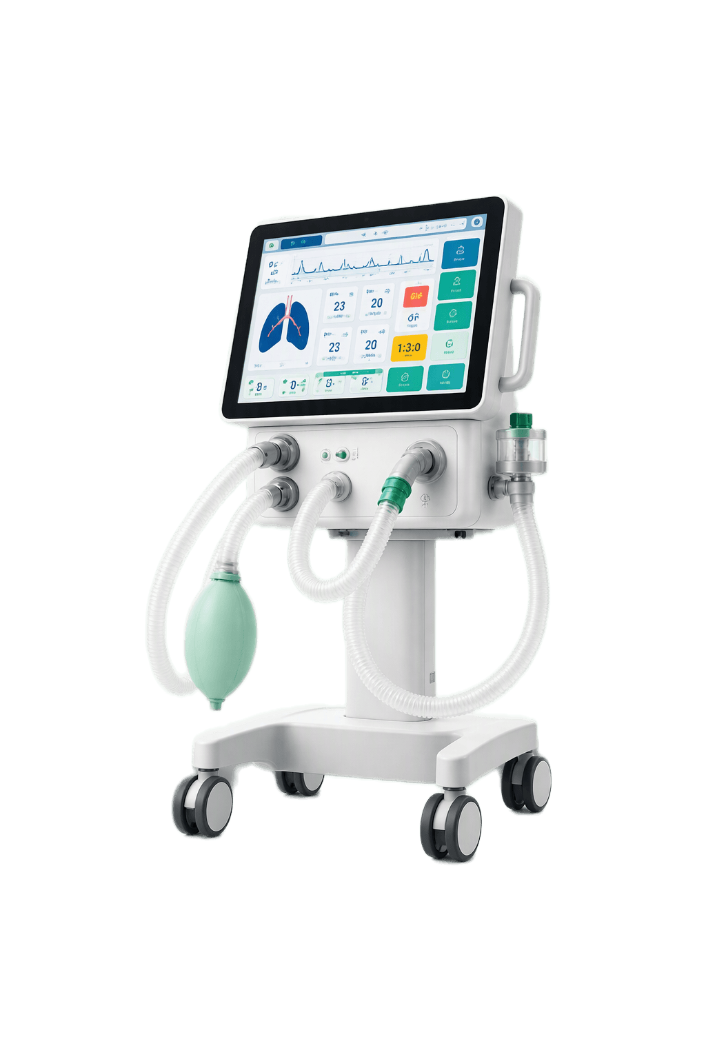
How could clinicians make critical decisions quickly without increasing cognitive load?
Building decisions on evidence
We combined desk research with a clear research plan to challenge assumptions and guide the fieldwork ahead.
Goals: Identify success signals for critical tasks and opportunities to reduce time to action.
Assumptions: Clinicians are the primary users, affordability influences adoption, and simpler workflows may reduce errors.
Methods: Desk research, clinician interviews, and rapid usability checks using early prototypes.
Learning from existing evidence

Literature review across journals, standards, device manuals, and existing ventilator systems.
Making the System Visible
We mapped the people, interface conventions, and navigation structure around the ventilator to understand where design decisions would have the greatest impact.
Understanding the Care Ecosystem
We mapped the people involved in selecting, operating, maintaining, and experiencing the ventilator to understand their roles and different needs.
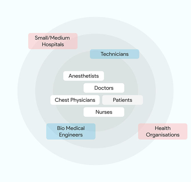
Stakeholders mapped by their proximity to the product and patient-care experience.
Studying Interface Conventions
We studied common ventilator layouts to understand how monitoring, therapy settings, alarms, physical controls, and power states are typically organised.
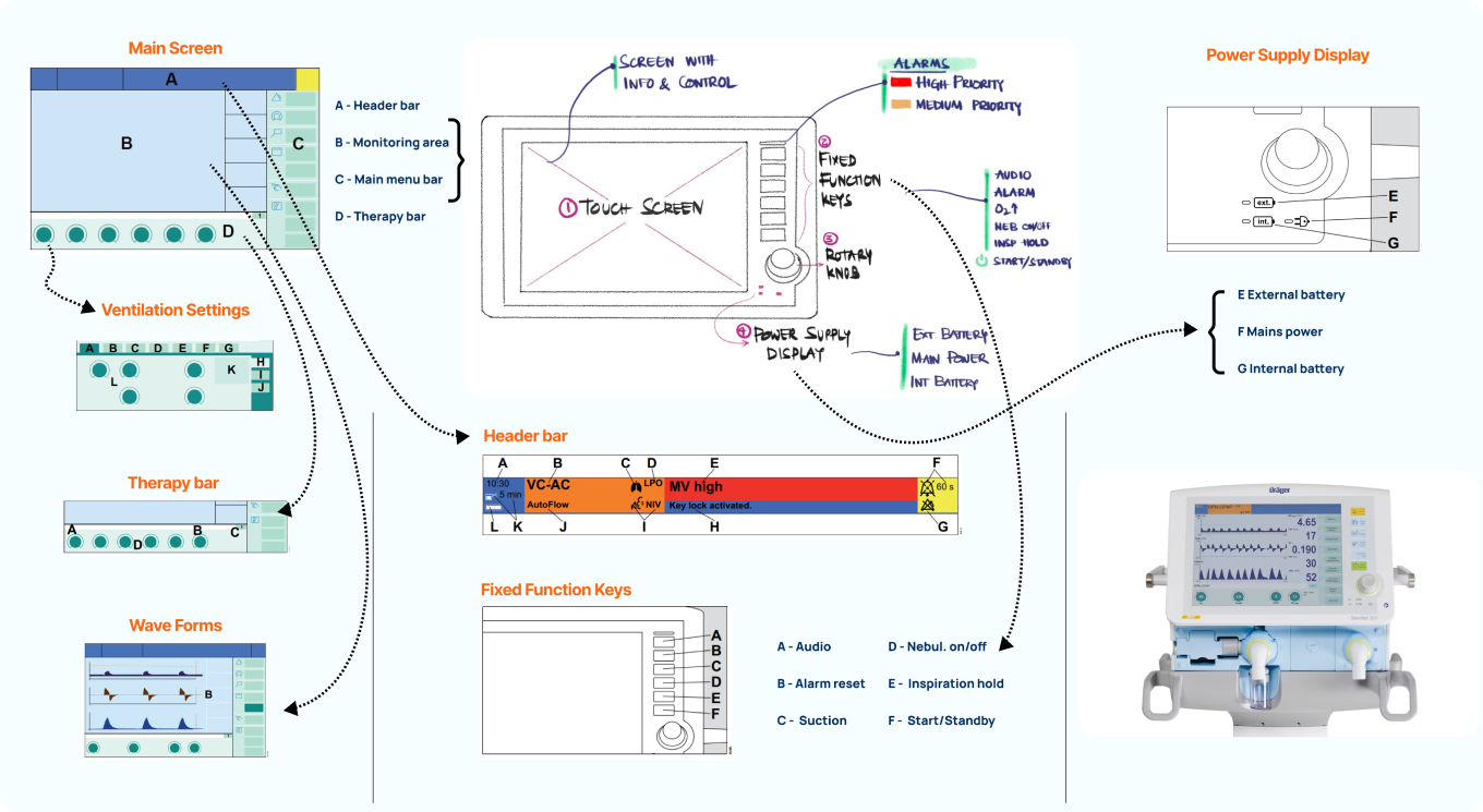
Common interface zones, physical controls, alarm cues, and device states.
Mapping the System
We traced screens, menus, settings, and connections from the existing ventilator documentation to understand navigation depth and system dependencies.
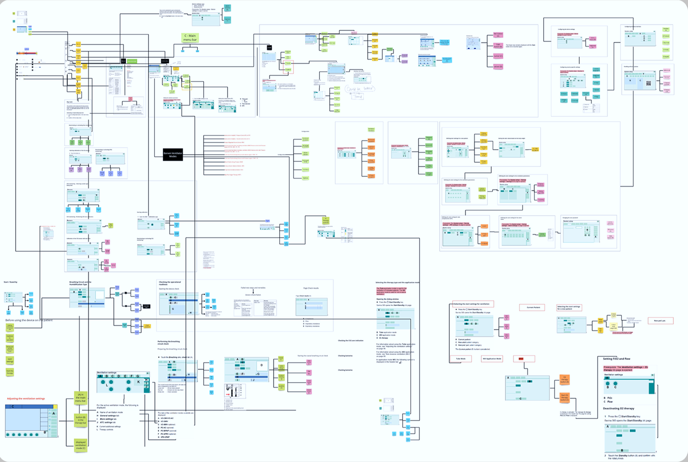
System map showing screens, workflows, settings, and their connections.
Seeing the product in Action
We traced complete ventilator workflows and evaluated existing products to understand where interactions became slow, unclear, or difficult to operate.
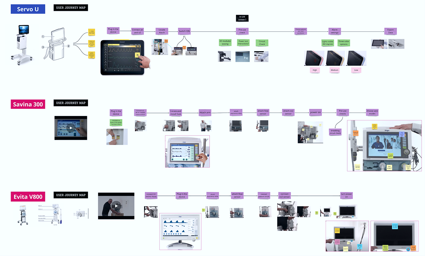
Tracing Complete Workflows
We mapped key tasks across three ventilators, from initial setup and pre-use checks to ventilation settings, alarms, and data review.
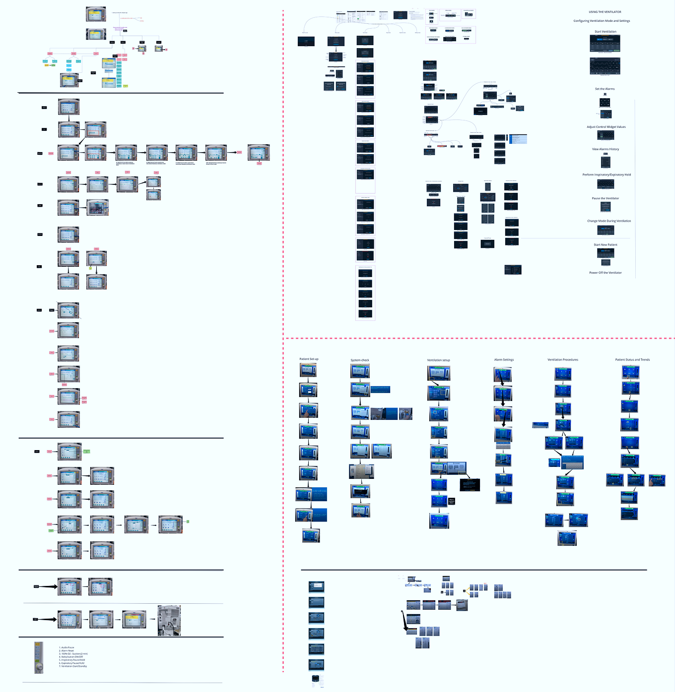
Comparing Interaction Paths
Hands-on walkthroughs revealed how similar tasks required different paths, controls, and numbers of steps across competing ventilators.
What the comparison revealed
- 1
The scroll wheel and physical buttons enable swift navigation through options, providing tactile feedback.
- 2
Menu structure and control placement directly influenced how quickly users could locate and adjust settings.
- 3
Similar clinical tasks followed inconsistent paths across devices, increasing the effort required to build familiarity.
Turning Field Evidence into Design Direction
We combined observations from clinical environments with interview findings to identify recurring needs, operational constraints, and opportunities for the HMI.
Observing Care in Context
We visited critical-care environments to observe how ventilators were set up, monitored, adjusted, and managed within real spatial and operational constraints.
What stood out: Frequently used settings were difficult to locate, while deep navigation increased the time required to complete critical tasks.

Field observations documenting device placement, physical controls, screen visibility, and ICU operating conditions.
Learning from Clinical Experience
Structured conversations with clinicians helped us understand frequently performed tasks, recurring frustrations, safety concerns, and the signals used to confirm successful actions.
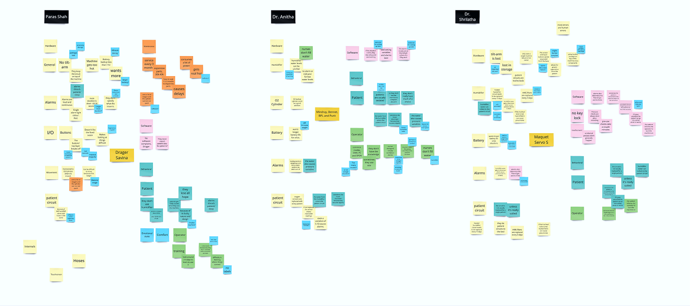
Capturing Individual Observations
Interview notes organized by participant, task, device, and recurring concern.
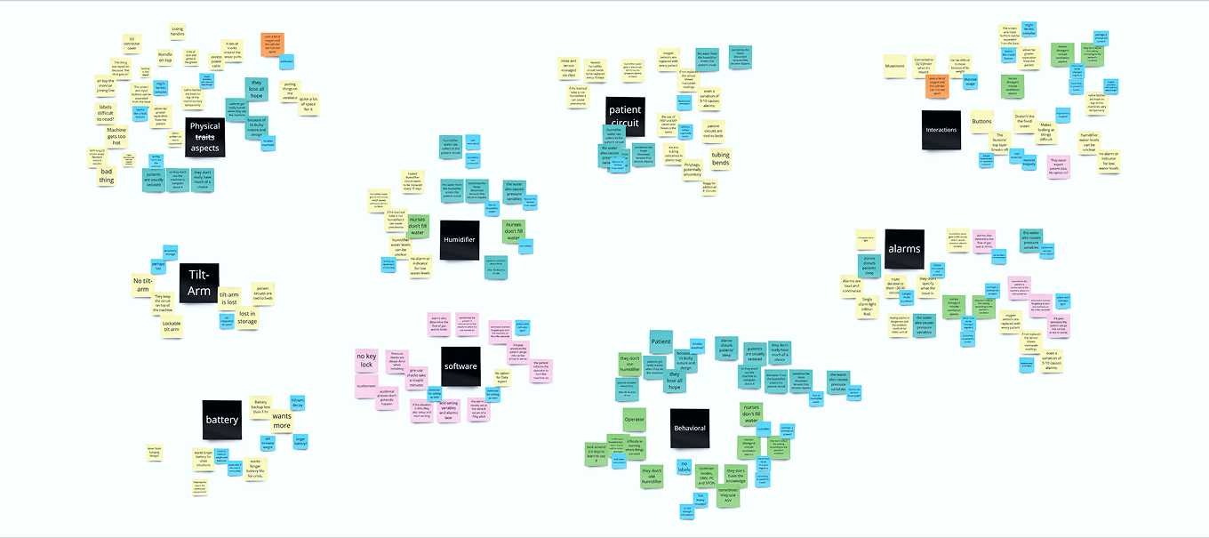
Grouping Recurring Patterns
Related observations clustered across hardware, software, alarms, setup, and clinical workflows.
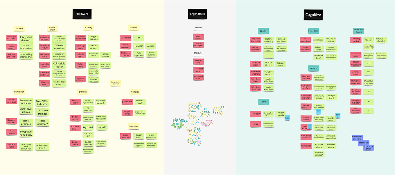
Framing Problems and Opportunities
Recurring issues translated into areas where the product experience could be improved.
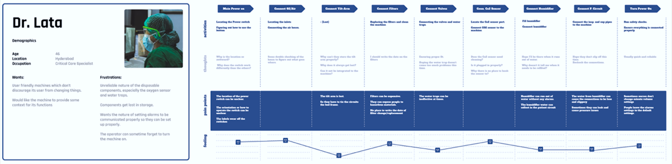
Visualizing Critical Tasks
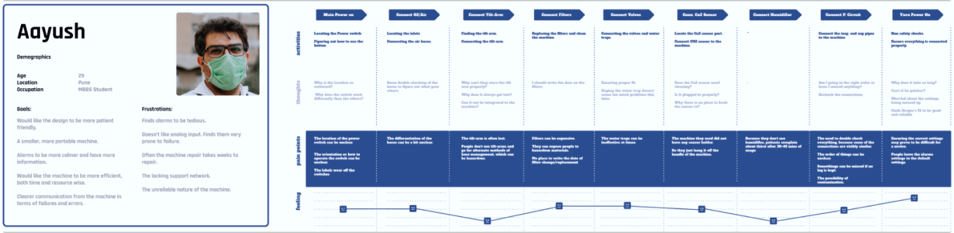
Key setup and connection tasks visualized to understand physical actions, sequence, and dependencies.
Empathy and User Journey Map
Synthesized research findings to highlight the most important opportunities for the ventilator HMI.
Alarm burden interrupts attention
Repeated non-actionable alarms can pull attention away from ongoing care activities.
Physical controls improve reliability
Gloves and missed touch inputs increased the value of tactile controls for frequent adjustments.
Insights: What the evidence suggests
Critical Actions Need Clearer Paths
Frequently used actions should remain easy to locate, supported by consistent visual cues and immediate system feedback.
Visibility Changes with the Environment
Screen information must remain distinguishable across changing lighting conditions, viewing distances, and clinical environments.
Physical and Digital Controls Must Work Together
Touch interactions and physical controls should provide consistent behavior and clear confirmation during frequent or time-sensitive tasks.
Turning Priorities into Clearer Paths
We translated the research priorities into a clearer information structure and mapped critical workflows before moving into interface design.
Information architecture
- We organized monitoring, ventilation settings, alarms, trends, and patient information around the tasks clinicians perform most frequently.
- Critical actions were kept closer to the primary interface, while higher-risk changes included clear review and confirmation steps.
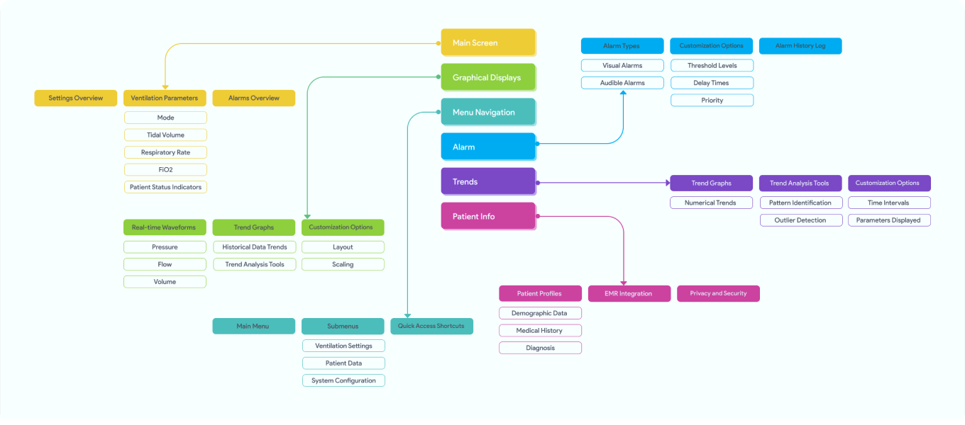
Information architecture organizing monitoring, settings, alarms, trends, and patient information.
Mapping Critical Interaction Paths
- We mapped the sequence of screens and system states across startup, device checks, patient setup, ventilation setup, monitoring, and alarm management.
- The flow helped identify unnecessary steps, unclear transitions, and opportunities to shorten frequently used paths.
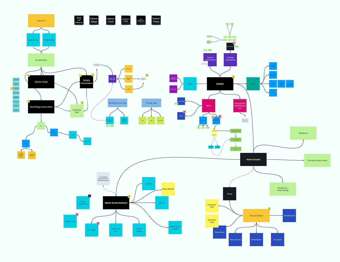
Interaction map covering startup, setup, monitoring, therapy controls, and system actions.
OutcomeA clear information framework and mapped flows enabled faster navigation, reduced cognitive load, and safer decisions in critical moments.
Bringing clarity to Every Interaction
We translated the information structure and critical workflows into a consistent interface designed for clear monitoring, reliable control, and changing clinical conditions.
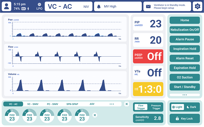
Refining the Interface in Context
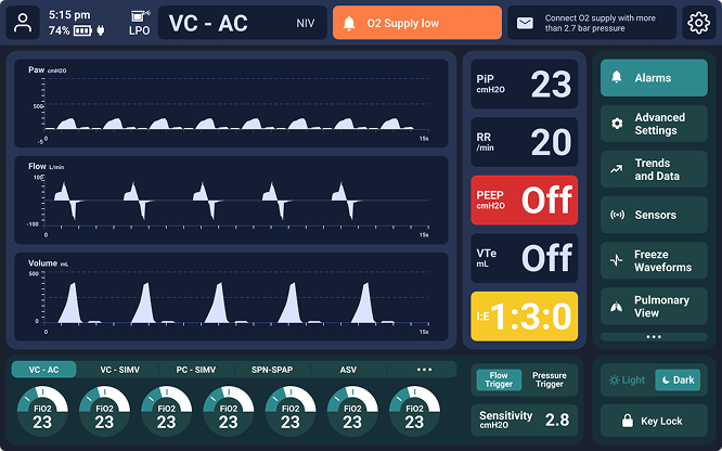
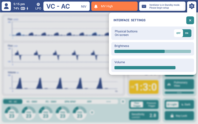
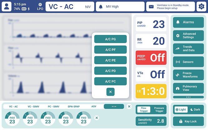
- High-fidelity prototypes helped us refine information hierarchy, control density, alert visibility, and the relationship between monitoring and therapy controls.
- Light and dark themes were explored to maintain legibility across changing environmental conditions while keeping frequent actions accessible.
Creating a Consistent Visual System
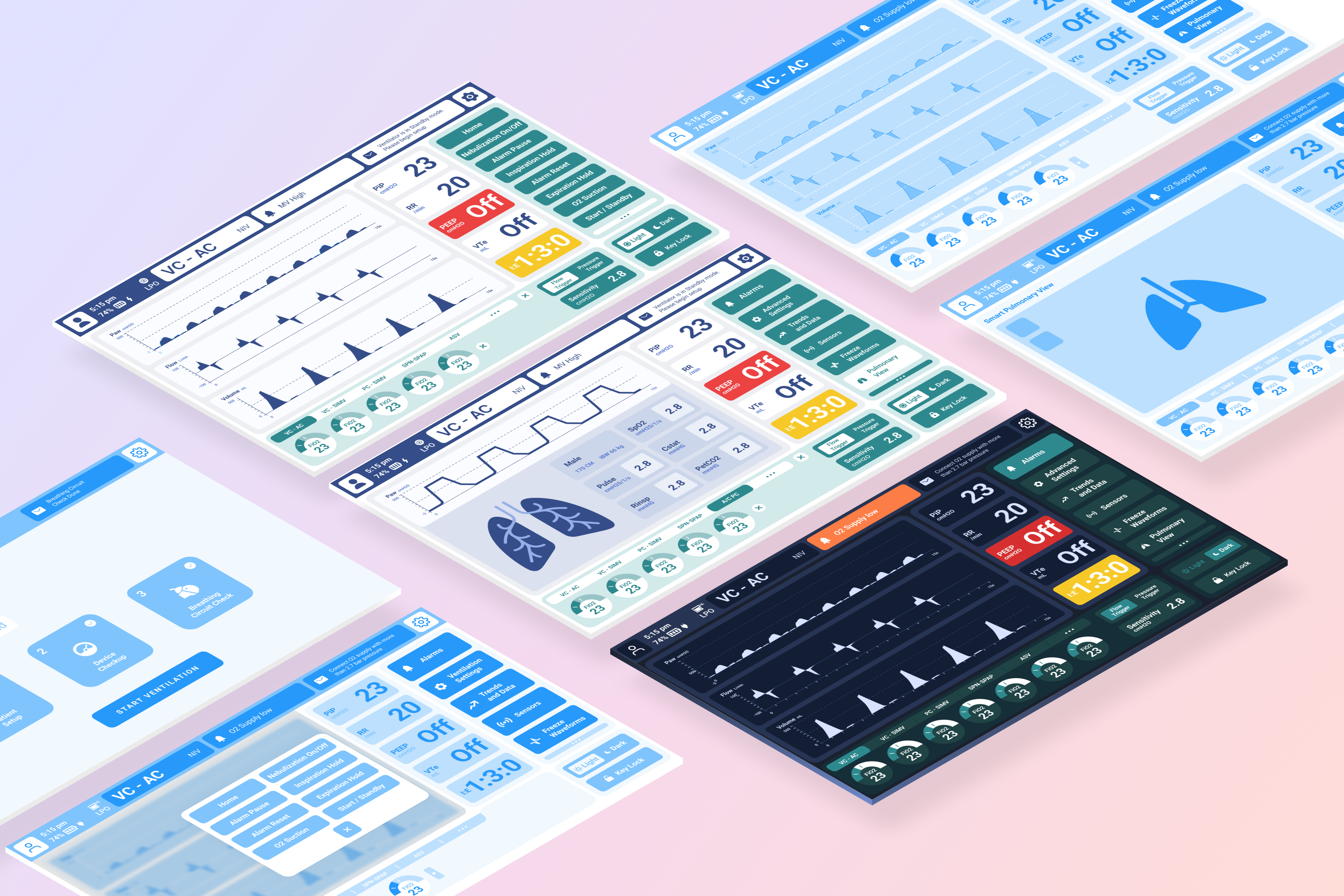
A shared visual system brought hierarchy, controls, alerts, and environmental themes together across the HMI.
Clear hierarchy
Critical data prioritized
Calm & focused
Low-light friendly
Consistent controls
Predictable and quick
Actionable alerts
Immediate recognition
Testing What Matters Most
We evaluated critical workflows with clinicians to understand whether the interface supported clearer recognition, faster task completion, and more reliable interaction.
Evaluating Critical Workflows
Task-based usability testing
Eight clinicians completed three scripted scenarios covering alarm response, parameter adjustment, and ventilation-mode changes. We recorded task time, interaction steps, errors, and missed selections.
Visual-recognition comparison
Interface variations were presented in a controlled order to compare recognition of ventilation mode, active alarms, and key parameters at different viewing distances.
UX outcomes : Tangible wins
Recorded signals from task-based usability and visual-recognition comparisons.
38%
38% faster time to action
Median completion time decreased by 38% across the tested alarm-response and parameter-adjustment scenarios.
32%
32% fewer interaction steps
The revised workflow required 32% fewer taps and physical-control actions across the primary tested path.
94%
94% recognition accuracy
Participants identified the active mode, alarm state, and key parameters with 94% accuracy during the visual-recognition task.
75% fewer errors
Error attempts
Average incorrect mode or parameter selections decreased from 1.6 to 0.4 per tested task after introducing clearer grouping and a review step.
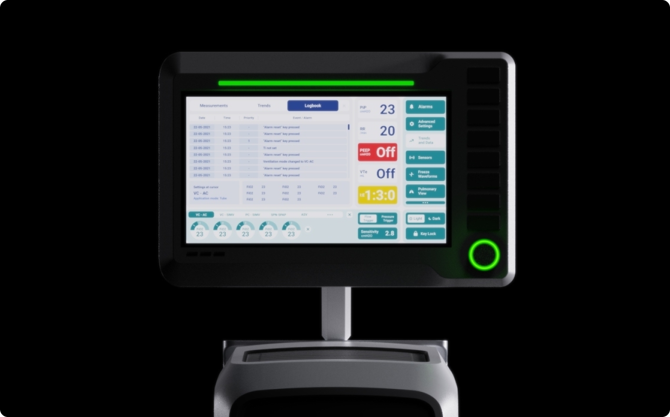
Testing helped us focus the final experience on what matters most in critical moments.
Selected project details have been kept high-level to respect confidentiality and participant privacy. Additional process context can be discussed during an interview.

