

Evolving Niagara Cloud
I led the experience design for a clearer, more connected Niagara Cloud Suite workspace for managing building systems at scale.
- My contribution
- Designed the core Remote, Backup & Restore and Data Registration flows, and made accessibility its own backlog item rather than a pre-launch audit.
- Role
- Strategy & Design
- Team
- PM / POs / Scrum / Architects
- Platform
- Cloud & Web
- Focus areas
- Strategy · Accessibility
01. Background
Scaling an enterprise IoT platform.
Context
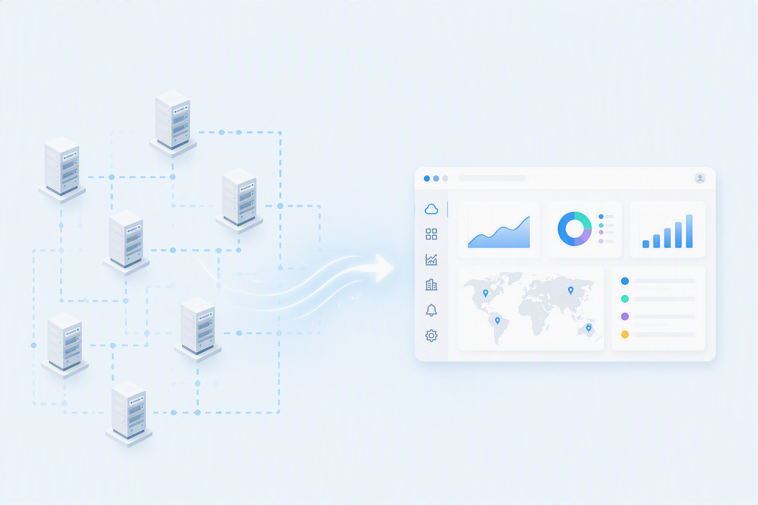
Niagara connects diverse building systems through a common framework, traditionally deployed within individual on-premises environments.
Shift
Extending these capabilities into a multi-tenant cloud experience introduced more information, relationships and operational context for users to navigate.
Connected building systems
HVAC
Lighting
Energy
Security
Niagara Framework
The central integration engine.
Cloud services
Remote Access
Backup & Recovery
Data Services
Core Challenge: How could people navigate a distributed building ecosystem without losing operational context?
02. The tension
More scale meant more to track.
Bringing more building information into a shared cloud experience created new complexity.
Friction
Orientation: Navigate information across customers, sites and devices.
Visibility: Recognize current conditions and what needs attention.
Context: Understand the status and information behind an issue.
Two user perspectives

System Integrator
Manage connected systems consistently across customers and sites.
- Navigate customers, sites and devices
- Verify data and system status
- Investigate issues with the right context

Facility Manager
See what needs attention and know where to begin.
- Understand current building conditions
- Recognize priorities and exceptions
- Move from overview to detail
Shared experience needs
Find
Surface what needs attention first, without hunting across every view.
Understand
Give important information enough context to support the next decision.
Act
Create a clear path from identifying an issue to investigating it further.
Together, these needs shaped a clearer direction: help users find what matters, understand it in context and know where to go next.
03. Concept evaluation
Evaluating interactions.
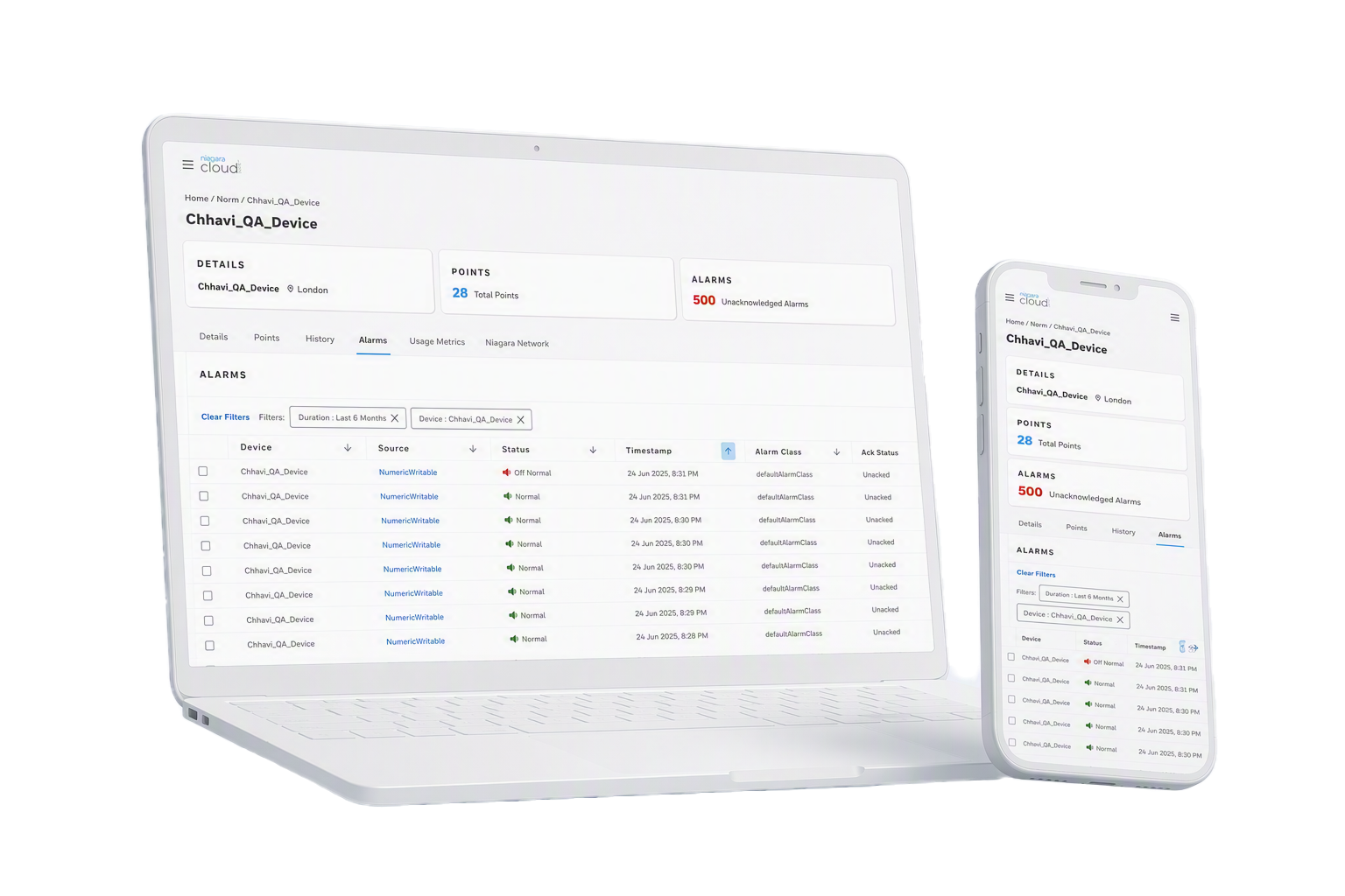
We tested early web and mobile concepts for the Device Details experience with System Integrators, to understand where information needed greater clarity, context and paths to detail.
16
System Integrator participants
4
SME connects
2
Web and mobile prototypes
Evaluation
Key Insights
Prioritize
Surface critical alerts requiring immediate attention.
Clarify
Use intuitive terminology that matches the user's mental model.
Contextualise
Anchor live data with clear timelines and status markers.
Explore
Create direct paths from high-level summaries into supporting details.
Alarms emerged as the single highest-priority area for this work.
These findings set the brief for the next phase of the redesign.
04. The turning point
From raw data to understanding.
Testing showed that exposing device metrics was not enough. Users needed a clear path from high-level awareness to technical investigation.
Design direction
Bring important system states forward while keeping supporting detail easy to reach.
1. Summary
See asset health at a glance.
2. Priority
Identify alerts requiring attention.
3. Context
Understand status, timing and related context.
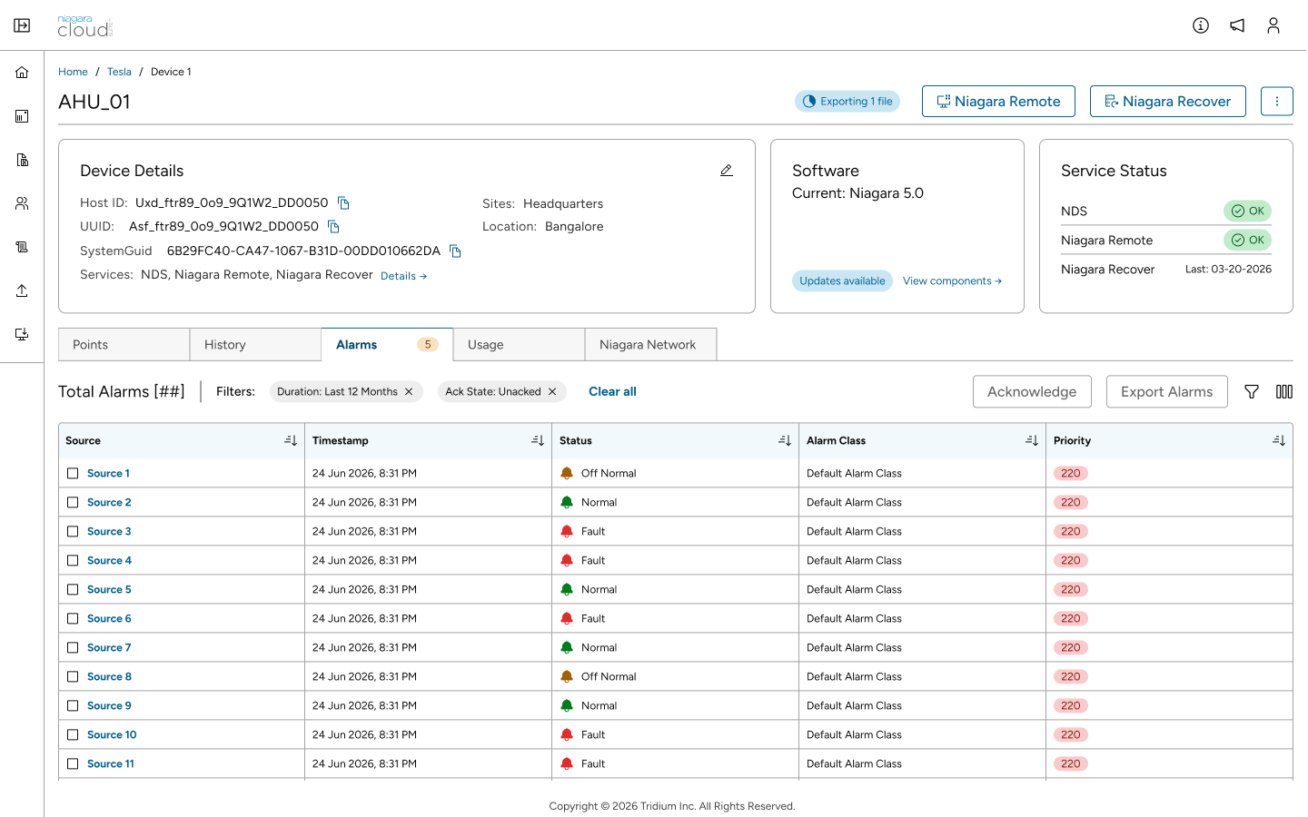
4. Detail
Explore the supporting telemetry history.
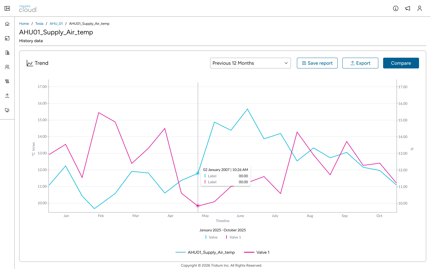
This progression became the interaction direction for connecting summary, priority, context and detail across the evolving experience.
05. Product evolution
How the experience evolved.
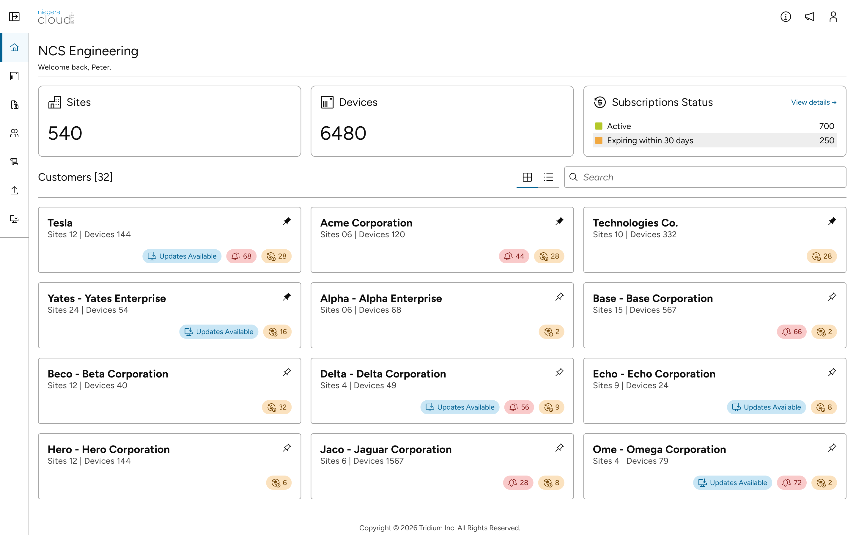
That interaction direction evolved release by release. As Niagara Cloud Suite expanded, each release addressed a new experience need: establishing structure, creating continuity and bringing operational attention forward.
Evolution across releases
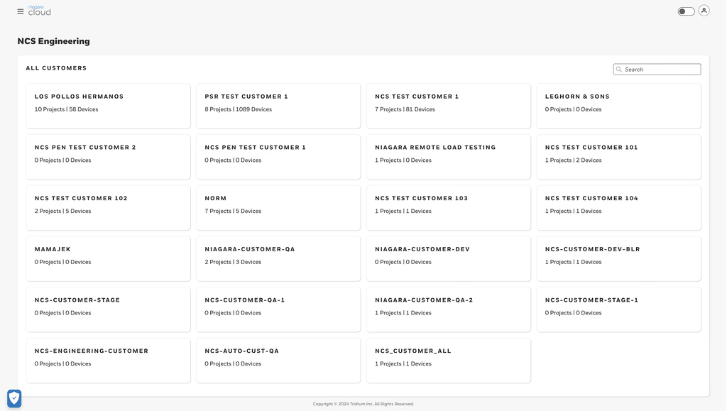
1. Structure
How could users find the right environment?
Established the hierarchy across customers, sites and connected devices.
- Locate customers and sites
- Establish the path into deeper information
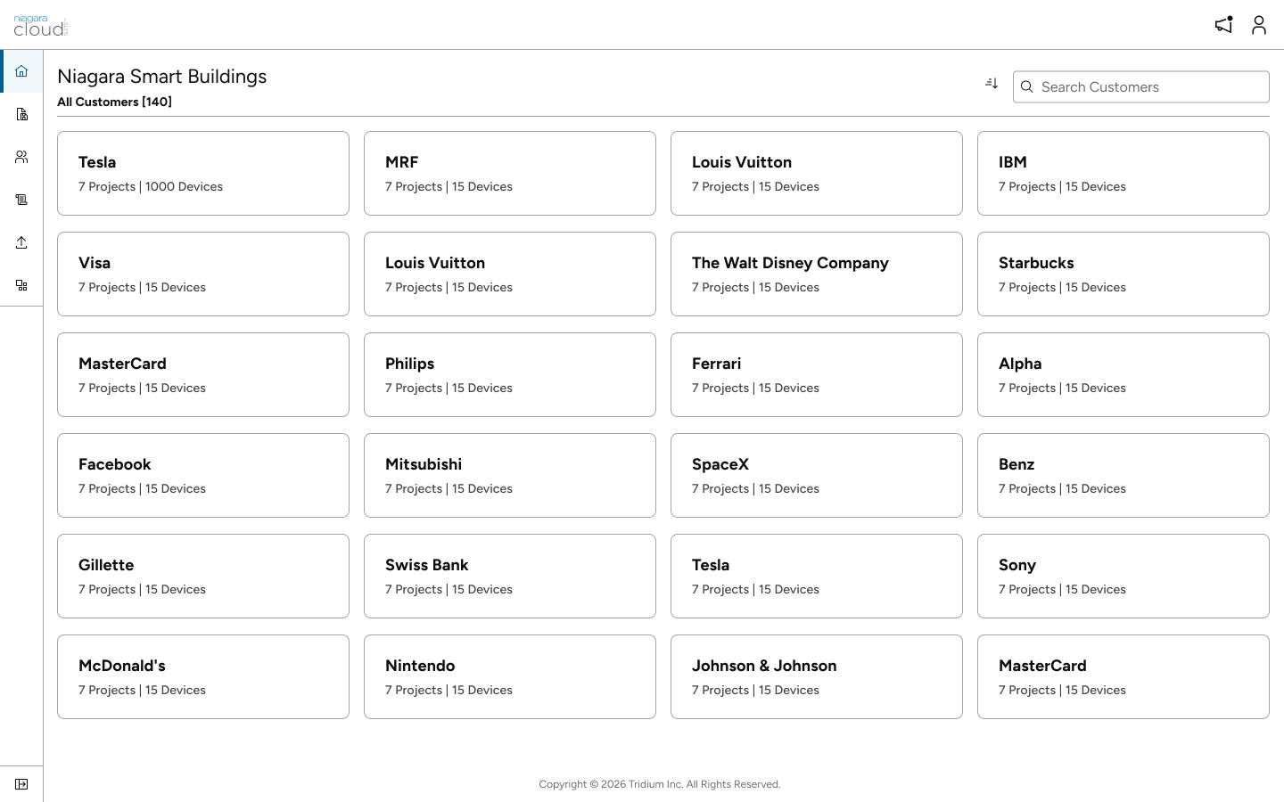
2. Continuity
How could users maintain context as the product expanded?
Aligned navigation and interaction patterns more closely with the wider Niagara product experience.
- Maintain context across levels
- Create more consistent navigation patterns
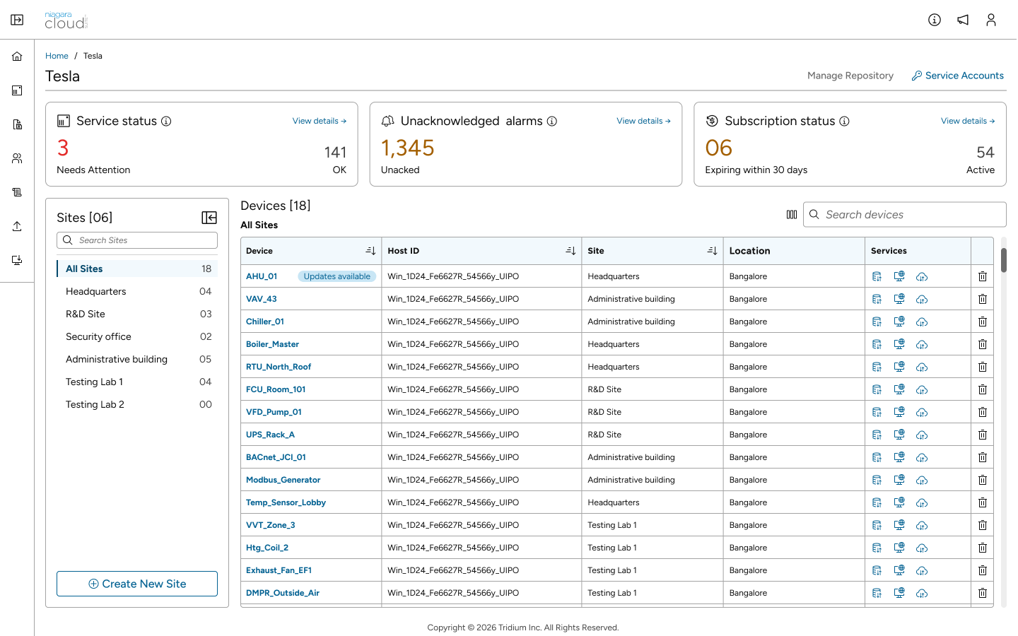
3. Awareness
How could the starting experience help users decide where to begin?
Brought important status and operational information into the starting experience.
- Surface important status earlier
- Guide users towards relevant detail
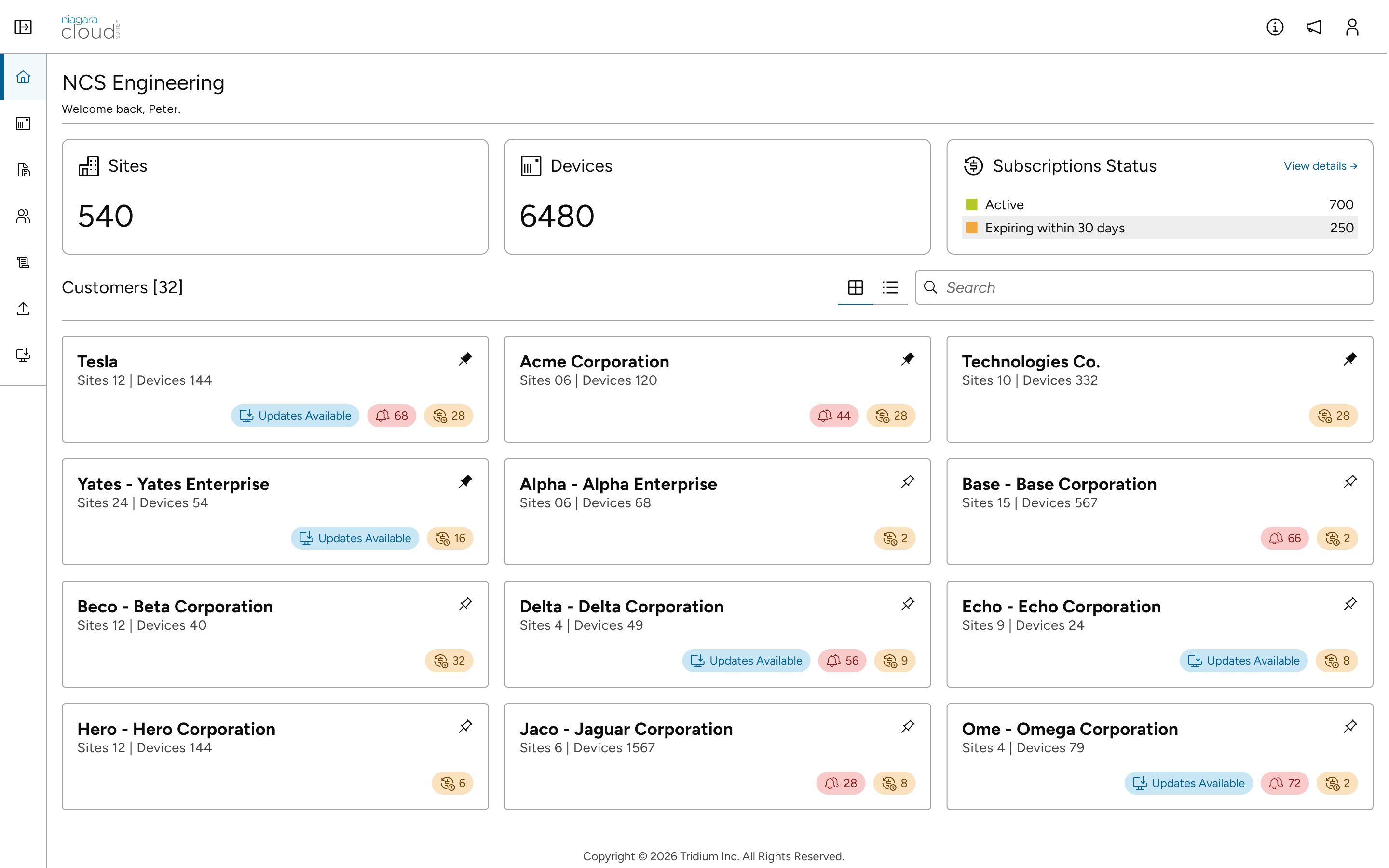
Evolution in action: Each release expanded the experience while strengthening how users understood and navigated the product.
06. Outcomes and reflection
Validating usability.
The platform is live in beta. Evaluation focused on whether users could locate important conditions, understand them in context and reach the supporting detail efficiently.
Beta participation
20+ System Integrator teams
Active deployment across distributed enterprise environments.
Continuous feedback
Direct insights from live in-product surveys and targeted interviews.
Evolving adoption
Consistent, growing weekly active user retention across all features.
Findability
Locating specific system states.
92%
Task success rate
Time to insight
Identifying critical alerts.
1m 42s
Median time
Comprehension
Understanding asset data accurately.
89%
Correct interpretation rate
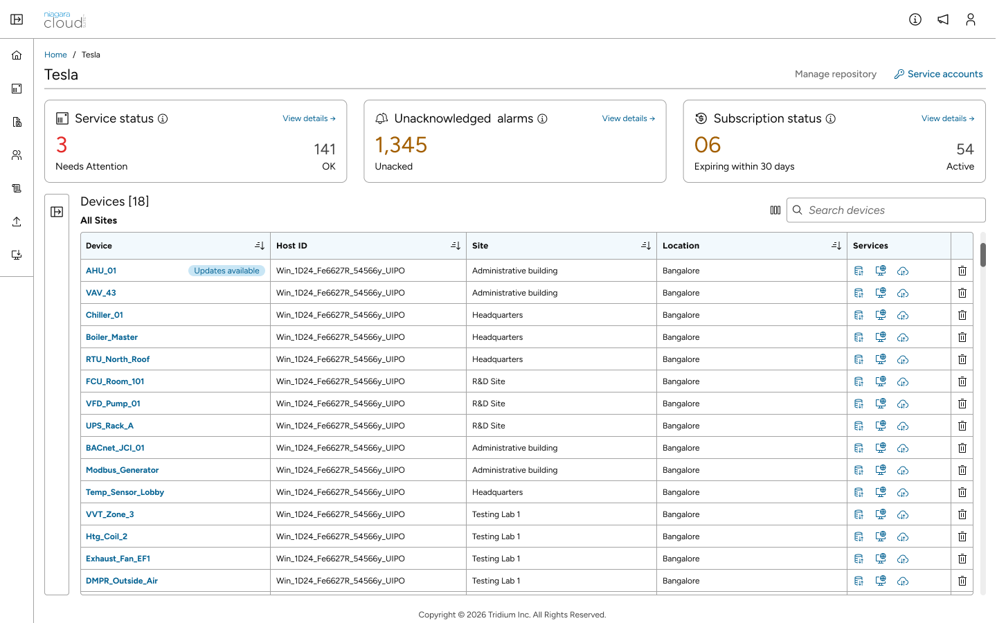
Reflection
This project taught me that scale isn’t really a data problem — it’s a clarity problem.
The opportunity was not to show users more information, but to connect summary, priority, context and detail more clearly.
* Selected screens, data and implementation details have been adapted or omitted to respect confidentiality.

